By Vikram Singh
Almost every other day, I see a headline about the latest trend that is going to have a massive impact on hotels and travel. Some might even be worth exploring. However, the fact remains that if your hotel booking engine is hard to use, none of the trends will have any impact on your net operating income and profits.
Having worked in hotels most of my adult life, and having traveled extensively, I have vast experience booking rooms every way possible: using phones, travel agents (yes, I am that old), OTAs, and directly from apps. The one consistent problem I find on hotel websites is a disregard for the basic usability principles that form the foundation of an online shopping experience.
Let’s review the Top Ten hits when it comes to bad booking experiences.
1. The One-Hit (One-Screen) Wonder
Let me take you all the way back to 2004. Booking engines were still in their infancy. That was the year the one-screen wonder was born. It was introduced to independent hotels as the greatest thing since the Beatles arrived in America. The catch? It was a usability disaster.
In this type of booking engine, guests were expected to review room photos and descriptions, and select dates, room types, and rates, ALL on one screen!
I tirelessly campaigned against this technology back then, but the public relations machine worked harder and had a much broader reach. Their message – “Did you know our one-screen technology allows consumers to make a hotel reservation in one click?” – proved irresistible to many hoteliers. They installed this software on hundreds of independent hotel websites worldwide; each install was followed by a press release full of praise.
In 2010, I came face to face with this monster. While stuck at Chicago’s ORD airport, I tried booking a last-minute room. But the one-screen booking process took so long, I did not have time to complete my reservation before boarding the flight. The hotel got my booking from my Expedia account. They paid a commission because they had invested in the wrong technology. You can imagine how many other bookings were abandoned on their website and booked through online travel agent (OTA) websites.
Of course, the one-screen booking engine was eventually discontinued. But not soon enough. The real economic impact can never be accurately measured. Don’t forget: while bad tech was being sold to hotels using gimmicks and press releases, Booking.com and Expedia were making it easier and easier for guests to book a room at your hotel via their own websites.
2. Way Too Many Questions
When a guest finally decides to book a room at your hotel, why delay the purchase by asking so many questions? I am on your booking engine, with my credit card/online wallet ready…so why not take the booking as quickly and easily as possible? Remember…there’s a good chance I’m at an airport, in the back seat of a taxi, on my limited lunch hour, etc.
This is one of the core issues I have with almost all of the mainstream independent hotel booking engines. The number of required fields makes the experience a little too much like an interrogation by a government agency.
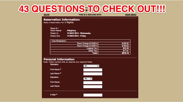
As recently as 2014, I encountered one of the biggest hotel booking engine horrors of my life. I analyzed an asset and discovered that their booking engine had 43 questions before checkout! Later the same year, I saw this booking engine provider at a hotel tech conference and found out that 1500+ hotels and inns were using that system! I had to leave the exhibition hall and sit outside for a while to recover from the shock.
Generally speaking, you need to severely limit the required fields on your booking checkout page. Require only what you absolutely MUST HAVE from your guest before giving them a reservation confirmation.
“Way too many questions, you must think I trust you.” – Future (Jumpman)
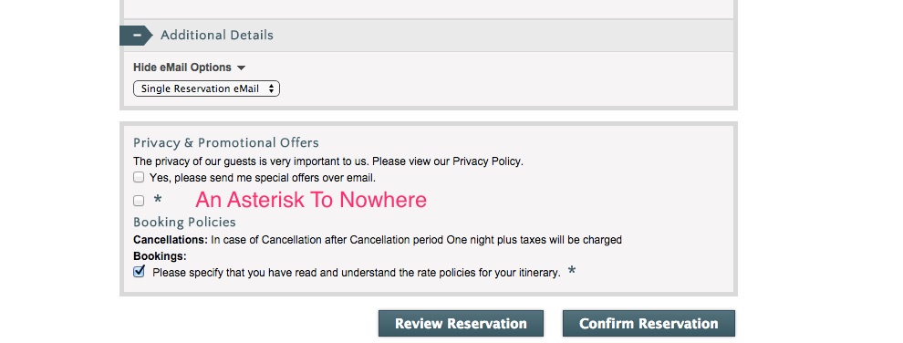
Next: why use a teeny tiny asterisk for a required field, which then turns into a big red warning when it’s not filled out? Clearly indicate required items at checkout; don’t make guests go back and repeat steps.
Finally: in 2018, do we need a mandatory title field? Do you really need to know if I am a Mr, Mrs, Miss, Dr, HRH, Lord, Earl, Duke, Baron, or Knight? It’s awkward and even offensive. People of every gender, class, and profession pay with the same kind of money.
Wait, one last thing..
I present you with an asterisk to nowhere that cracks me up every time.
3. Land of Confusion
The optimal layout for the checkout process has been mastered by all the major OTAs, like Booking, Expedia and Airbnb. All the hotel technology providers need to do is follow the blueprint. The multi-million dollar investment in UX (user experience design) and usability testing has already been done for us! But instead of following these best practices, many booking engines continue to confuse the guests… resulting in a direct hit to your revenue and profits. Some of these checkout screens remind me of the 1986 Land of Confusion video by Genesis: way too much happening for anyone to understand what it means on their first try.
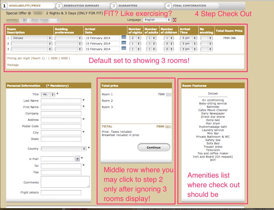
Check out this disastrous layout with my notes:
What is happening here:
- Useless hotel rate code jargon is likely to confuse your guests.
- Default setting shows more than one room, even when one room is selected in the date/rate calendar.
- Odd placement of the “Continue” button in the middle of the layout makes your guest think too hard.
- Listing amenities during the checkout process is distracting and gets in the way. This info belongs on the rooms page.
- Four-step checkout? No, thank you.
4. Failure to Launch
According to research from Baymard Institute, around 70% of all shopping carts get abandoned. Slow and non-responsive carts are abandoned right away. The general consensus is that if you cannot efficiently collect my payment, you do not respect my time. That’s why slow-loading booking engines can seriously wreck your direct revenue.
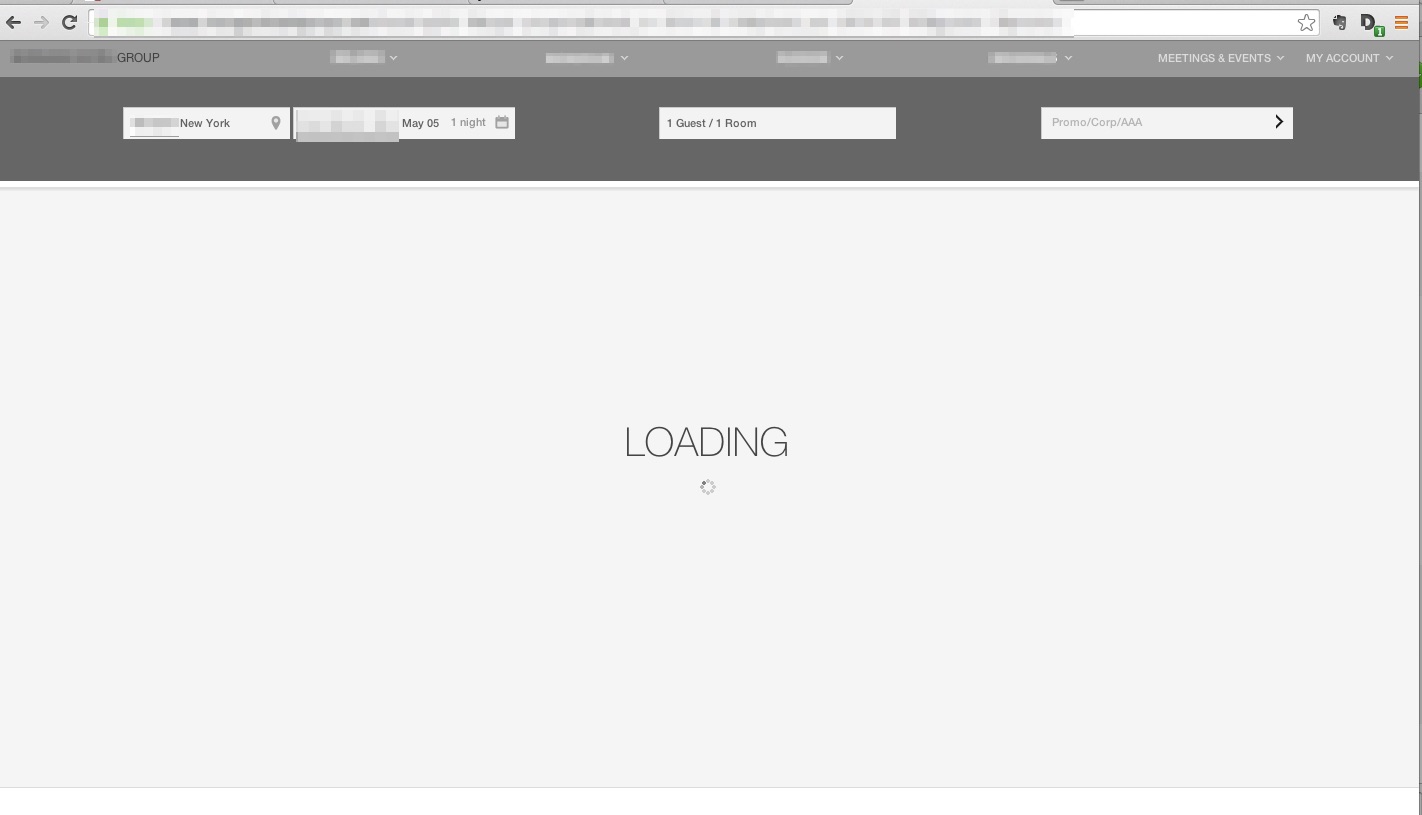
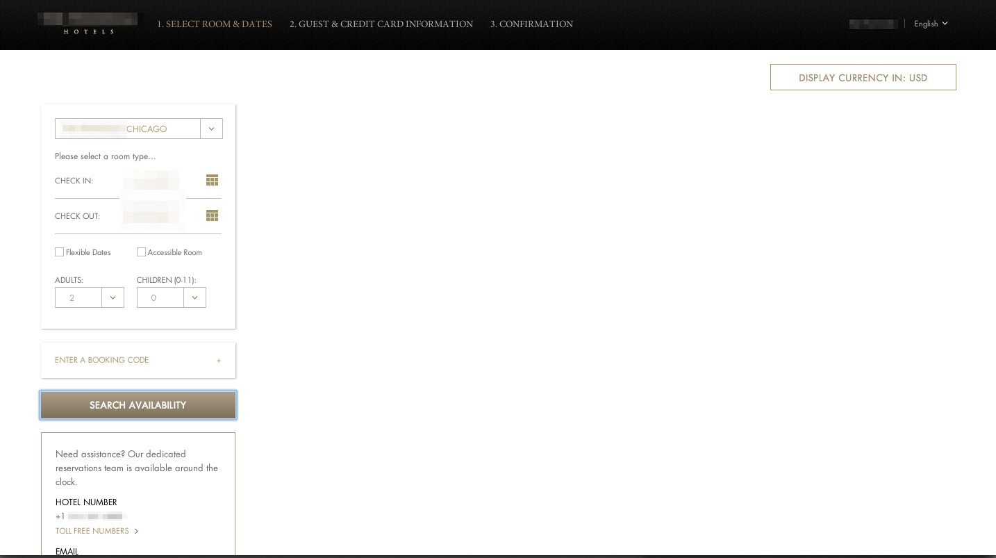
The screen shot below is from a boutique hotel brand’s booking engine. This is what a typical user on high-speed internet was seeing when trying to book a room in NYC. Loading, if it happened at all, was taking over a minute (tested from multiple locations and internet providers).
Guess what? This group filed for bankruptcy in 2009 due to massive losses in revenue. I am not a detective, but it’s elementary that a non-functioning booking engine might have hastened their demise.
Here is another example from a luxury hotel brand based in Asia, which has some of the highest ADR rooms in Hong Kong. Every non-responsive session is probably costing them a ton. Luckily for them, they are publicly listed and backed by heavy institutional investors. It’s easy to be lazy with other people’s money.
What happens when your booking engine does not load quickly enough? Here are some possible outcomes:
a) The same booking comes in via OTA minus a 15-20% commission.
b) The guest books another hotel.
c) The guest decides to give up on their trip and stay at home (voted least likely outcome by revenue and digital experts worldwide).
A and B negatively impact your revenue, and option C is highly unlikely. One other possible outcome is that the guest calls your hotel reservations line…but kids these days don’t talk much on phones. So that outcome becomes less likely all the time.
5. Just Plain Broken
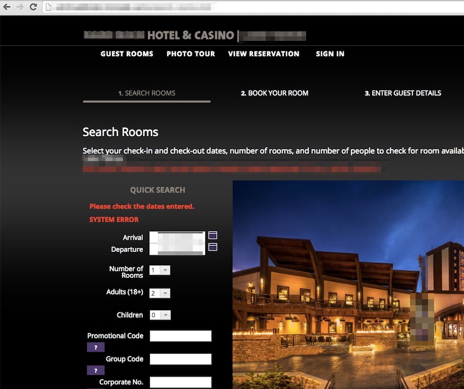
Every now and then I see a hotel asset that is completely failing online. In a time when the majority of bookings are happening online, you have to have a booking engine that works! Here is one that actually showed a System Error right on the checkout screen:
This booking engine worked great in some Western US states, but not so much on the East coast or London. It worked in Barcelona, but not Dubai. You get my drift? A shopping cart working part-time is just plain broken. It’s crucial to test, test, test, and repeat when it comes to your booking engine. An error message that literally spells out “system error” in red will decimate your brand, guest loyalty, direct revenue, and online marketing efforts.
6. Back in Black
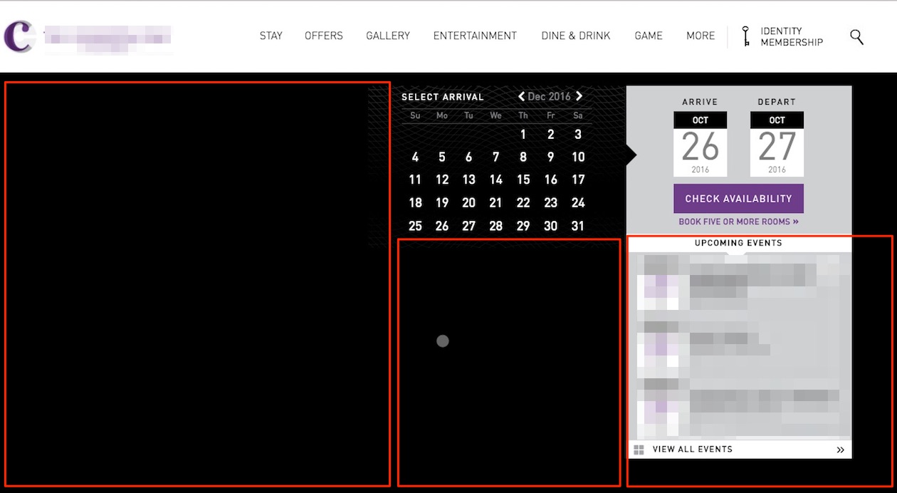
Black is my favorite color. It’s good for a lot of things, but not as a background for a hotel booking engine. The top retailers of room nights around the globe (Expedia, Booking, and Airbnb) all use a white background for their ecommerce transactions. When it comes to website conversions, usability is the only thing that matters. In a desire to match the “look and feel” of their website, some hotels are using a dark background for their booking engine, making it really hard for everyone to use.
In the example below, selecting dates on a black calendar is really difficult…difficult enough for your guests to give up without completing the transaction. When you highlight dates, nothing happens to show you have done it. There is also a LOT of wasted space, where the booking engine could have displayed useful information. Is this blank space, or is something not showing up against the background? Either way, I’m inclined to run over to Expedia.com and take care of this booking quickly, in a more familiar layout.
7. The Discount Horror
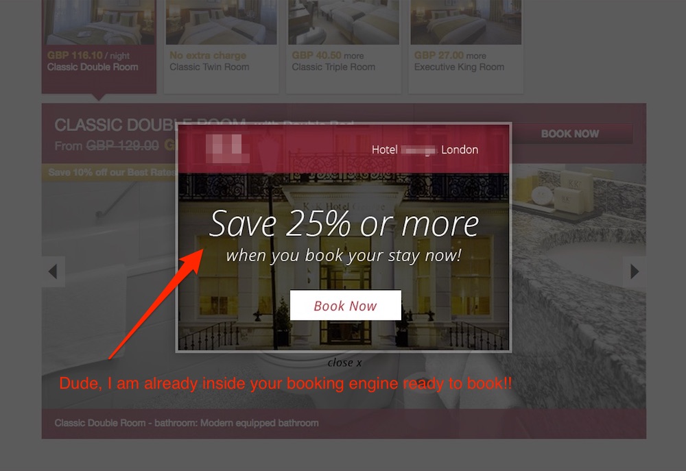
Showing your guests a popup that offers savings of “25% or more” when they are already INSIDE your booking engine and have already SELECTED the room they want is a really bad idea. Stop getting in your own way! This reminds me of a scene in When a Stranger Calls, a1979 American horror classic. When I saw this I exclaimed, “The discount popups are coming from inside the booking engine!!” It’s quiet ironic that this engine markets itself itself as a champion of conversions and direct bookings!
8. Blast From the Past
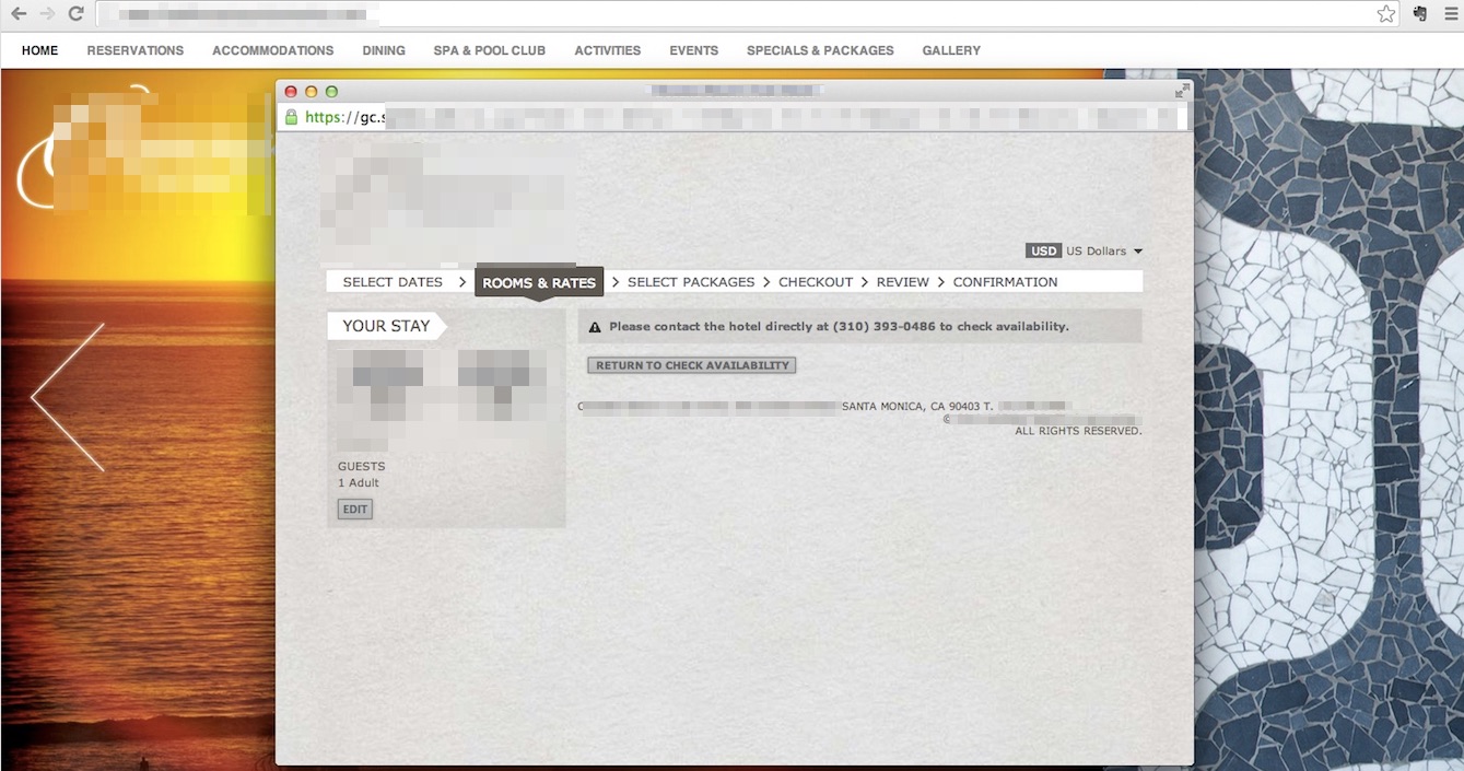
In 2018, there are hotels that still have not integrated a booking engine into their website. If a date search on your website’s home page calendar triggers a pop -up window… please stop doing everything else and get it fixed.
9. Too Much Information
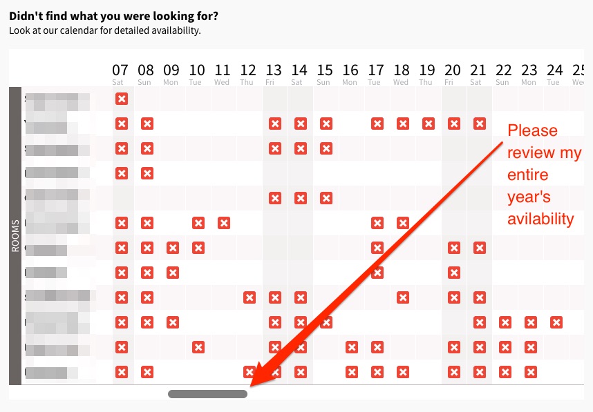
Nobody likes folks who overshare. Why would you share your entire year’s business with me when I am just trying to book a room? Are you saving me more searches? Do you want me to change my vacation plan based on your availability? You don’t think I can find another place to stay in your town? Are you starting to see my point? Thank you and stop this.
10. Do You Even Mobile?
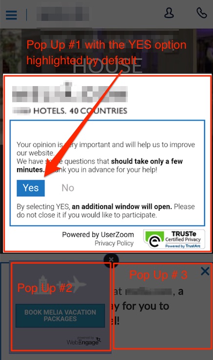
Everything I have listed above gets compounded 100X when things move to a small screen. I could load up one hundred screenshots here, but the example below truly captures the struggle hotels have when it comes to mobile revenue and conversions. This hotel has done the unimaginable…served me THREE popups (including one survey and one special offer) when ALL I ever wanted to do was give them my money! This, folks, is the bad mobile booking experience to rule them all.
In mobile, you have to do testing. You cannot entirely outsource the responsibility to make sure your booking engine works properly on all the major screens your guests are using. You have to dive into your analytics and then follow up in the real world. One way is to go to your local phone store; time yourself and a bunch of your closest friends to see how long it takes to book a room at your hotel for some random dates. Brace yourself for the outcome!
The hotel brand in the example above has over 300 hotels in 40 countries worldwide. You’d think they would have friends to alert them…but guests never do. If you cannot sell them rooms on a mobile device, there are some spectacular mobile booking options available on the Expedia/Booking network that they will end up using.
Bonus Tip:
The single most amazing mobile experience offered in the travel business is the functionality of the HotelTonight app. If you have not tested it yet, please download the app to see mobile ecommerce done right. Anyone who can take the app experience to the mobile web will be the world’s top hotel mobile booking engine.
Oh, and my 2014 article still stands…do not sell $7 rooms on HotelTonight.
Conclusion
Offer protection, kill doubt. In a world of online scams and identity theft, you must make sure that you present guests with a secure and reassuring booking engine. A shady looking booking engine is certain to fail.
Make it easy. Most guests will abandon a booking engine that is hard to use while asking for too much personal information. Please note that booking engines and surveys are two very different things. Nobody should ever feel interrogated on your hotel booking engine.
There are many places where things can go wrong on your website. But none is more important than your booking engine. It is the core of your direct revenue strategy and deserves your undivided attention.


