
By Max Starkov
The full year results for 2015 are in and one thing is clear: the age-defining shift from desktop to mobile and tablet devices continued its rigorous pace: more than 20% of online bookings and roomnights are generated from non-desktop devices (smartphones + tablets), while nearly 50% of web visitors and over 44% of page views come from tablets and mobile devices. The mobile channel contributes directly to additional 30%-40% bookings via the voice channel (HeBS Digital Research).
According to Google Research, nine out of ten people are “cross-device” Internet browsers and researchers, using multiple devices sequentially (moving from one device to another at different times). Smartphones are by far the most common starting point for sequential activity: 65% of users start their research on a smartphone and 60% continue on a desktop device. As an example, 55% of users use multiple screens sequentially when researching pricing information in travel.
Hoteliers, if you haven’t invested in and taken advantage of this rapidly developing multi-channel, multi-device world, this should be your top priority in 2016. Mobile should never be an afterthought; it should be part of your overall strategy.
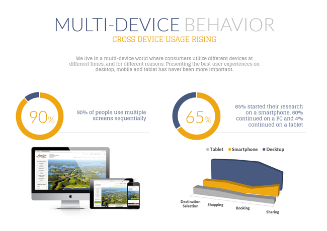
The explosion of cross-device user engagement presents a monumental challenge to hotel marketers: creating and managing a digital presence across three distinct distribution and marketing channels (desktop, tablet and mobile), and engaging this new cross-device travel consumer at every “touch point.”
The Shift from Desktop to Mobile and Tablet Continues:
Across HeBS Digital’s hotel client portfolio, consisting of thousands of hotel properties, we saw this shift occur in every data category.
Sources of Traffic and Revenue by Device Category in 2015:
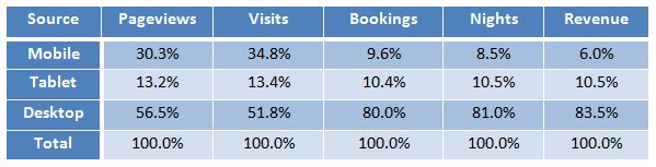
Notable developments in 2015:
- Over 20% of bookings, 20% of roomnights and 17% of revenue came from non-desktop devices, i.e., tablets and mobile devices. If we include voice reservations originating from the hotel mobile website, more than 35% of bookings and revenue originate from the non-desktop channel.
- 49% of web visitors and nearly 44% of page views were generated via non-desktop devices (mobile and tablet).
- The iPad outperformed all other tablet devices and was responsible for 94% of tablet revenue and over 90% of bookings and roomnights.
Compare this to just two years ago, 2013 when non-desktop devices (mobile and tablet) generated:
- Less than 12% of revenue, bookings and roomnights
- Less than 29% of web visitors and 30% of page views.
The Growth of the Mobile Channel Continues Year-Over-Year:
We are witnessing stable year-over-year growth in the mobile and tablet device categories, while desktop traffic, bookings and revenue lose ground.
Mobile vs. Desktop: Percent Increase/Decrease in 2015 vs. 2014:
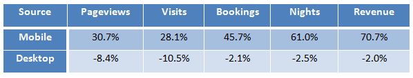
Here are the most notable developments in 2015 compared to 2014:
- All desktop metrics are on the decline, year-over-year, including bookings, revenue, and website traffic.
- Revenues on desktop websites declined by 2%, while increasing by 70.7% via mobile (not counting voice reservations from mobile, which account for an additional 30%-40%).
- Mobile metrics are still growing at rapid pace, an indication that mobile bookings are becoming mainstream and moving away from last-minute, spur-of-the-moment booking decisions.
Hotelier’s Action Plan to Take Advantage of the Continuous Growth of the Mobile Channel
What should hoteliers be doing to meet the challenges created by this dramatic shift from desktop to mobile and tablet? To begin with, hotel marketers should view these challenges as new opportunities for revenue generation and customer engagement across all three “screens:” desktop, mobile and tablet.
Here are a few actions steps to help hoteliers address this multi-device user behavior we are seeing today:
1. Engage Customers at all Touch Points to Maximize Direct Online Revenue
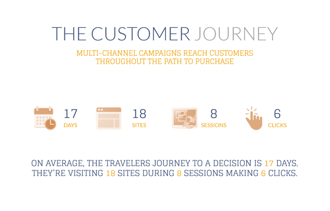
When you think about the process for planning travel, it’s never a one-way street. Travel consumers might start with a google search, watch a video, go to the hotel website, check reviews, and eventually make a booking. People are going through so many different touch points, and there is not a particular order. You have to be ready to stand out when someone makes their way to your website in their journey.
The average travel consumer journey takes about 17 days, and the average visitor goes through 8 research sessions, 18 site visits, and 6 clicks before making a booking (Google Research). Emarketer research shows that people go through 15.5 touch points just within the week before they actually make the booking.
The foundation for building effective multi-channel campaigns is finding the best marketing initiatives based on the customer segment you are targeting, and reaching that target segment at every touch point of their online travel planning process.
Each of the three screens (desktop, mobile and tablet) must be integrated in the hotel’s marketing strategy. Multichannel marketing should become the centerpiece of every hotel marketer’s overall marketing and distribution strategy in order to reach consumers at every touch point.
In 2016, multichannel campaigns will address your property’s business needs, reach consumers at every touch point, and maximize the results of your digital marketing strategy.
Read more in the “2016 Checklist to Maximize Revenues from Multi-Channel Campaigns.”
2. Optimize the Hotel Website’s Presence on the Three Screens: Desktop, Tablet, and Mobile
Hoteliers should optimize their presence on all three channels to provide the best user experience on each device (desktop, mobile, tablet). These three screens are only the beginning. We have yet to tackle the new threats and opportunities arising from wearable devices, connected car devices, etc. In the very near future we will be talking about a 5-, 6-, or 7-screen digital marketing and distribution world.
Invest in your property website. Optimize your presence on the three screens.
If your property website is two or more years old, does not offer responsive or adaptive design, does not support the best user experience on the three “main” screens, and crucial targeting capabilities like dynamic content personalization, or does not have state-of-the-art merchandising and reservation abandonment prevention capabilities, it is time to upgrade.
Invest in a Content Management System (CMS) with revenue-driving technology.
Choose a CMS technology that supports both responsive and adaptive design and empowers you to seamlessly manage your website presence on the three screens via a single dashboard while engaging users and maximizing revenues from the direct online channel. At the minimum your website CMS should offer the following capabilities:
- Dynamic Content Personalization (DCP): through your CMS, create business rules that allow you to target website visitors with personalized content, images and promotions/packages based on origin and demographics of users, device (desktop, tablet or smartphone), past booking history, etc., and dramatically increase conversions.
- Complete Merchandising Platform: to combat commoditization and “sell on value” as opposed to “sell on rate,” hoteliers need an effective website merchandising strategy. Your CMS should offer a full-range merchandising technology solution for the hotel website to sell more rooms, create more group leads, and engage more potential guests and ultimately allow the hotel to "sell on value" as opposed to "sell on rate" and to maximize revenues on the hotel website like never before. Read more in the “Hoteliers Action Plan to Win Back Market Share from the OTAs.“
Choose Responsive or Adaptive Design Wisely
In 2016, provide the optimum user experience to meet the needs of your website visitors on desktop, mobile and tablet. With mobile visitors expected to surpass desktop this year, hoteliers can’t afford to not to.
The main difference between Responsive and Adaptive Design is the type of content as well as the manner in which web content is served on the different devices: desktop, mobile and tablet.
Traditional Responsive Website Design serves the full (and same) website across all devices (desktop, smartphone, tablet) by modifying and reshaping the exact same website to fit into each screen size, from large desktop screens to small smartphone screens. The intent is to optimize the “viewing” experience regardless of the device being used by the website visitor.
- Choose Responsive Design for simpler websites that do not need more than 15-25 pages of content: restaurant websites, and websites for select-service to midscale-service properties. Design should be simpler and content should be kept minimal so the user experience is not compromised.
Adaptive Website Design – aka Responsive Design on the Server Side (RESS) – customizes website content and the overall user experience to the device (desktop, mobile, tablet) the website visitor is using. This is achieved from the same Content Management System (CMS), and ensures the maximum user experience, relevancy of information and conversions by device.
- Choose Adaptive Design for premium, luxury, boutique, upscale and full-service properties, multi-property and brand websites with deeper content, extensive imagery, and a complex product offering and content sections.
3. Optimize the Hotel Website for the Google Mobile-Friendliness Algorithm Update
The Google Mobile-Friendliness Algorithm Update, which Google instituted back in 2015, gave preferential rankings to websites deemed by the Googlebot as being “mobile-friendly.” The search engine’s all-powerful algorithm now favors sites that are configured properly for display on mobile devices, taking front-end design and back-end development considerations into account. Google assesses whether or not a page is mobile-friendly on a pass/fail basis. If a page or site satisfies its front- and back-end requirements, it receives a passing grade and could earn higher rankings on search engine results pages, as well as a special “Mobile-Friendly Badge” to identify the content for its mobile user-friendliness.
Perform a Website Technology Audit:
Audit whether your property website’s content management system (CMS) is engineered to comply with the latest Google Update. Using industry-leading technology as the backbone of your hotel website is the best way to ensure your site stays compliant with Google’s mobile-friendliness requirements. For example, HeBS Digital’s award-winning CMS technology – the smartCMS – provides the flexibility and responsiveness so that when such algorithmic updates occur, we are able to immediately act on them and roll out automatic updates to ensure mobile-friendliness, even as Google’s requirements evolve.
Perform a SEO Technology Audit:
Performing an SEO audit of your website, including a full audit of link structure, re-sizing of images, reconfiguring design elements, or replacing Flash with crawlable, search-friendly code, allowing the Googlebot to crawl CSS and JavaScript, is vital to ensure your website complies with Google’s mobile search requirements.
Make Sure Your Property Website Has User-Centric Content & Website Design:
In addition to running your hotel website on an adaptable and mobile-friendly CMS technology, remembering to create and display content with the user in mind is critical. Google’s emphasis on mobile usability should only reinforce the importance of designing and developing websites and creating content that benefits the user and serves a valuable purpose.
Boost Website Download Speeds:
Audit your website’s download speeds, especially on mobile devices. Slow mobile download speed is “killer” of mobile usability and a big no-no, according to Google’s latest Mobile- Friendliness Algorithm Update.
In conclusion, hoteliers must optimize their presence on all three screens to provide the best user experience and maximize customer engagements on each device (desktop, mobile, tablet). The three screens are only the beginning. We have yet to tackle the new challenges and opportunities arising from wearable devices, connected car devices, and others. In the very near future we will be talking about a 5-, 6-, or 7-screen digital marketing and distribution landscape.