By Steffan Berelowitz
Web design trends rarely stay still for long. In 2018, we’re seeing some creative new ideas and a few reimagined versions of retro designs. In the hyper-competitive hotel industry, great design is especially crucial. Guests compare options quickly and judge hotels within seconds based on the look and feel of their website.
Great design instantly tells your potential customers they’re in the right place. It lets them know your hotel offers the kind of experience they’re looking for. But more than that, it has the ability to distinguish you from the crowd, and hint at the possibility that your hotel offers something unique and special.
So what design trends are big in 2018? In the following post, we’ll look at five examples and show you how hotels are applying these trends to make their own websites rise above the competition.
1. Attention-grabbing imagery
In 2018, websites are getting bold and brave with color. Using vibrant colors and saturated gradients is a useful tactic to grab attention for sites that lack engaging imagery. Lack of images isn’t really an issue for most hotels, but we are seeing some hotels becoming bolder when it comes to picking their hero image.
Instead of completely filling the homepage with photos of their property, a number of hotels are integrating or leading with lifestyle imagery and brand-driven photos.
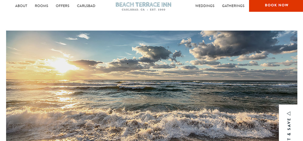
When visitors land on the website of the ocean-side Beach Terrace Inn in Carlsbad, they’re instantly met by the sight of crashing blue waves.
This full-width hero image does a great job of instantly communicating one of the hotel’s standout features—an idyllic setting right beside the Pacific Ocean. The impact is powerful, evoking an instant feeling of tranquility and escapism.
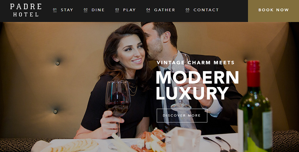
In contrast, the homepage of the Padre Hotel in Bakersfield uses imagery to conjure up a playful-meets-sophisticated lifestyle.
Another photo features a swish hotel suite with a rose petal-scattered bathtub and bubbling bottle of Rose. These vibrant, lifestyle-focused images are clearly aimed at couples and intended to sell the experience of a romantic and stylish city break.
2. Embracing bold fonts (and bringing back serif)
Thanks to new web CSS protocols, it’s now possible to use a wide variety of fonts to really show off your hotel’s personality.
The minimalist sans-serif font has dominated in recent years, but designers are becoming more adventurous and choosing fonts that create an instant impression. In 2018, that means a greater use of big and bold font.
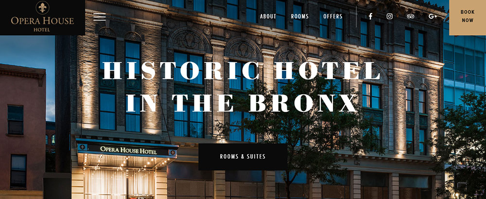
In the example above, the homepage of Opera House Hotel in New York goes supersized on its use of serif font. The typeface leaps off the page and gets all the focus ahead of the background image.
One of the other trends we’re seeing in 2018 is the return of serif fonts. This font had become synonymous with feeling slightly dated and stuffy. But as the flat design trend runs out of steam, designers are going back to the distinguished, off-the-page feel that serif font brings.
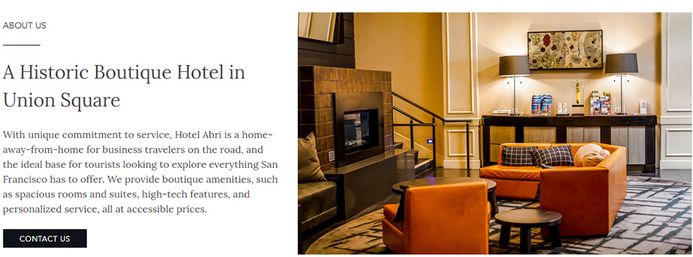
On the website of Hotel Abri in San Francisco, the classic feel of serif neatly reflects the property’s historic feel.
With its feeling of warmth and character, serif font can create a feeling of good old-fashioned values. Expect to see more and more websites using this style in 2018.
3. Broken grid layout
In web design, the grid is an invisible foundation used by designers to help plan where various elements are placed on the page. It’s used to ensure pages have a pleasing feeling of balance, and ensures a website has overall consistency.
But the grid can be broken. Why might doing this be a good idea? When the eye expects to see the same patterns, and then that pattern is broken, it can help grab attention. Used sparingly, breaking the grid can draw attention to a specific element on the page that you want your guests to look at.
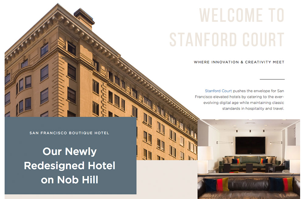
In the example below, the website of Stanford Court illustrates how the grid can be broken to create more white space. This approach draws attention to the text, and it also helps to create a generally more open feel.
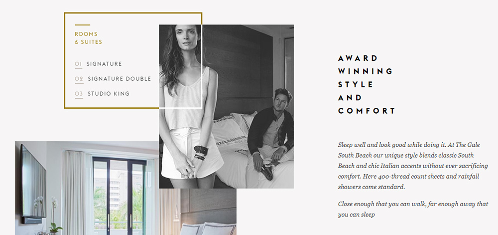
The Gale Hotel in Miami uses a more overt form of breaking the box. Here, a series of images overlay one another to create a stylized aesthetic that gives the page a more interesting visual feel.
Attention is particularly drawn to the (clickable) “Room & Suites” box, which frames imagery and text together. In this way, breaking the box can act as a conversion trigger by guiding the eye towards an area of the page that leads users deeper into the site.
4. Brutalism
New to the scene, brutalism is an unconventional approach that tears up the design rule book. Clean, light and ordered visuals are thrown out. Instead, brutalism is all about a disordered, chaotic style that goes against the mainstream principles you’d expect to see in a modern site.
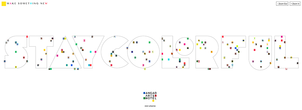
The website of soon-to-be-open Angad Arts Hotel in St Louis, Missouri is a good example of how brutalism can be used. The icons below can all be clicked and expanded to reveal words, photos, videos and sketches that other users have uploaded to the hotel’s online “Stay Colorful” mural.
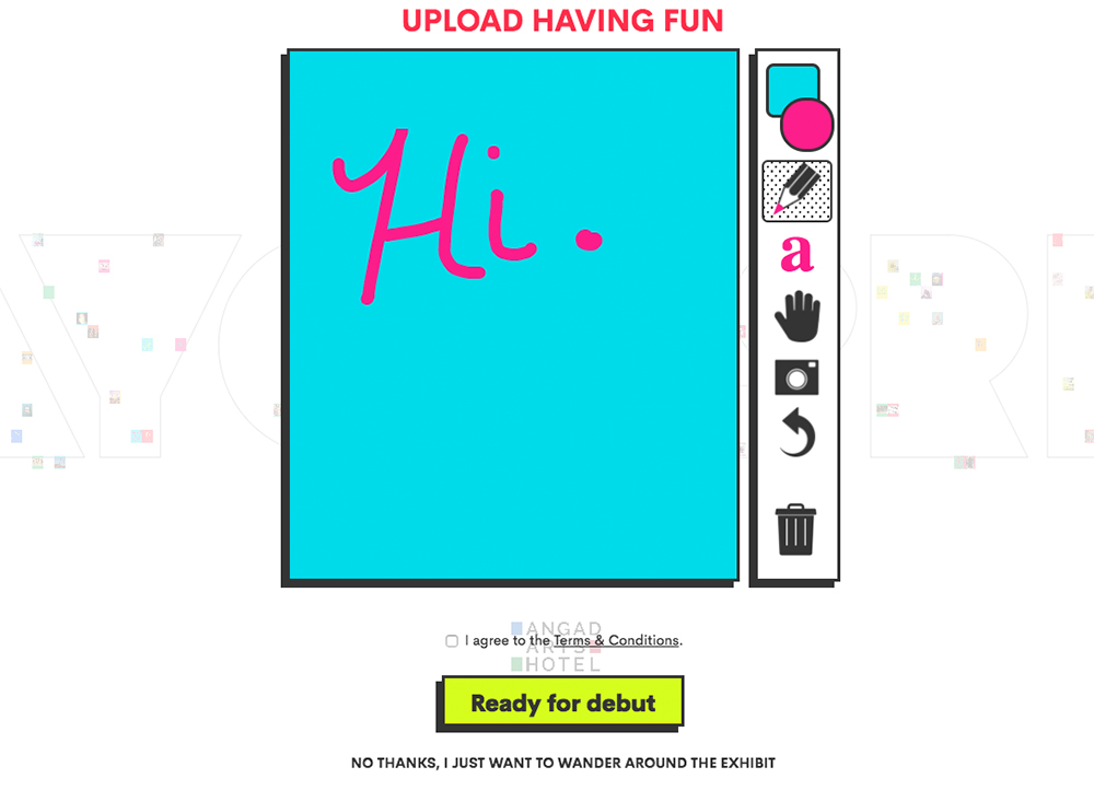
A colorful interactive tool allows visitors to leave their own mark on the site by creating their own drawings, typing out quotes, and uploading photos to leave on the site. The hotel will be the first in the world to not only let guests book by both room type, by also by the emotion of color. So this playful and abstract placeholder website is certainly in line with the hotel’s overall brand.
Obviously this approach will not be appropriate for a lot of hotels, but it does represent a striking design trend that when cleverly executed, can really set a website apart.
5. Non-distracting animation
There was a big trend in the 1990s for websites to feature brash and quirky animation. It all felt a lot of fun at first, but then it soon started to feel a bit over-the-top and garish. Thanks to CSS3 and jQuery, animation then become more subtle and refined, but there was still a tendency for it to be overused.
However, a form of “non-distracting” animation is starting to appear more frequently, often in the form of subtle hero videos.
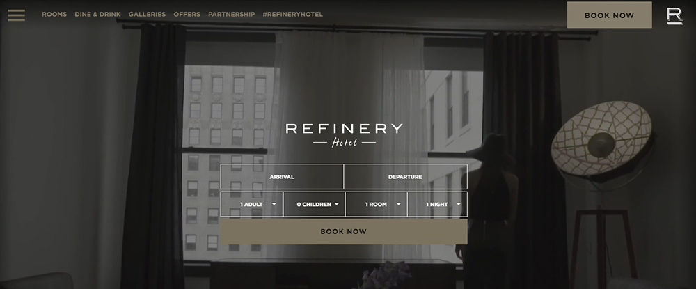
On the website of Refinery Hotel in New York, the hero section features a slow motion video of a hotel guest strolling towards the window. It softly draws the eye into the scene, without feeling distracting.
It’s a perfect example of how animation can complement rather than dominate the supporting text and visuals.
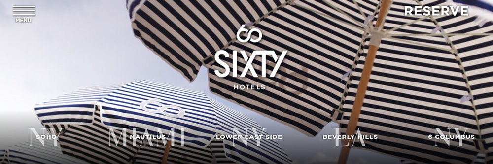
The hero image on the website of SIXTY Hotels takes an even more restrained approach. A static camera shows black-and-white parasols fluttering in the breeze.
It calls to mind ideas of the beach, and poolside relaxation in a cleverly understated way. Again, this demonstrates how a less-is-more approach to animation can still effectively communicate a mood and message.
The power of great design
Hopefully the above examples have fired up your imagination and illustrated some of the latest trends you might want to replicate. By using the right images, typeface, animation and visuals, your hotel website can tell a story and sell an experience that goes beyond words on a page.
However, bear in mind that your website also needs to keep usability and user experience in mind. Great design shouldn’t just be used for the sake of it. So be sure that whatever design choices you make, they feel consistent with the style and ethos of your hotel.


