Expedia developed the following white paper as a tactical guide on the best- and worst- types of images for hoteliers to include online in order to maximize bookings. The study was conducted at Expedia's User Experience labs to discover which hotel imagery would perform best. As a technology company, we can focus on innovations that will drive more demand to our hotel partners, while providing them with the capability to target the demand that they want, and easy-to-understand analysis and data to refine their distribution strategy.
Summary It is well known that the quality of a hotel's online brochure has a direct impact on shopper conversion and bookings. Robust hotel descriptions, a good collection of reviews and nearby points of interest all help the customer decide whether the hotel is right for them. Rounding this list out is compelling imagery, which can have a profound impact on a shopper's opinion of a hotel. Based on findings from a recent study commissioned by Expedia, this paper reveals findings on the most effective hotel imagery to convert shoppers into bookers.
Several types of images and image attributes were found to consistently evoke emotional reactions in shoppers. The predominant hotel image theme that evoked delight was the image of a bedroom with a window view that had a visual scene to gaze upon and light pouring in to brighten the room. Views from other vantage points such as living room, terrace, and restaurant were also deemed appealing when there were vistas of something interesting or beautiful. Standard lens images were considered more trustworthy and reliable, whereas distorted fisheye lens shots evoked negative emotion and suspicion that the hotel was "hiding something." A number of other image attributes were identified that evoked either delight or negative reactions in the shoppers and are detailed in this paper.
Methodology In the study, conducted in November 2014, subjects browsed online for hotels that they might like to stay in while their eye gaze and facial expressions were tracked in real-time using electromyography (EMG). Whenever there was an elevation in the EMG signal indicating either delight or negative emotion, the shopper was verbally queried on their reaction to the hotel image. The study encouraged the participant to shop in a way that is natural to them on whatever sites and using whatever methods they would if we (the experimenter) weren't there.
Findings Room with a view. The predominant and most prevalent hotel image theme found in this study was the importance of a room with a view. A hotel that showed an image of a room with a window view was more desirable and contributed to a positive feeling toward the hotel, and helped the shopper see themselves in the context of their trip. The image of a bedroom with a window view evoked more instances of delight than a photo of a room without a view, and both having light pouring in that brightened the room, and a pleasing visual scene to look upon were important contributing factors.
Forty-one year old female:
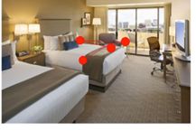
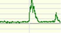
Shopper's verbal response: "I can see myself staying there."
Vista from Hotel. This "room with a view" finding extended beyond the bedroom, as various spaces such as living room, terrace, and restaurant also evoked instances of delight when there were pleasing vistas and light. Positive feelings were evoked in the shopper when seeing something interesting or beautiful out the window, like a beautiful beach, cityscape, or famous landmark. The delight evoked by the scene carries over to the hotel and increases the positive feeling about the hotel, even if the scene is common to the area and not exclusive to the hotel.
Twenty-five year old female:
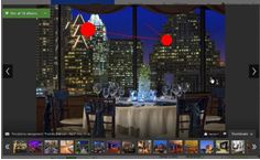
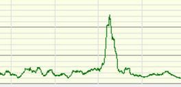
Shopper's verbal response: "I'm a sucker for cityscapes."
Unique and Attractive Features. If a hotel has unique features, they are often eye catchers and evoke delight and interest in the shopper. Therefore, images of these features should be displayed prominently, perhaps even the first photo visible (as in the example below), so that the shopper is drawn into the hotel early on in their search by these features
Forty-seven year old male:
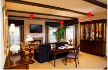
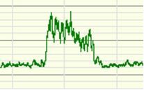
Shopper's verbal response: "Roomy, my kinda place."
Perspective, Balance and Distortion in Images. Room images that look natural were found to be important to shoppers, and evoked a sense of trust that the images were authentic and realistic representations of the hotel. Distorting images, such as those taken using fisheye or telephoto lenses, drew suspicion from the shopper and led them to think that the hotel was "hiding something." Drawing from this finding, images of rooms should not try to show too much in one shot. As one participant explained, "you need to have two shots of the room – one toward the window and one back toward the closest so you can see what you really get."
Close-up images can promote a sense of intimacy that makes the hotel feel more personal, and helps the shopper to "picture [themselves] there more easily." However, there should also be images that show perspective so shoppers can see what is around the feature, and allay any suspicions that the truth is not being shown. If the shot is too 'artsy,' shoppers may not be able to easily figure out what they are looking at, or are distracted from the hotel attributes by the odd perspective. Balance of various perspectives seems to be the key element in images to successfully communicate a delightful visual personality of the hotel.
Fifty-eight year old male:
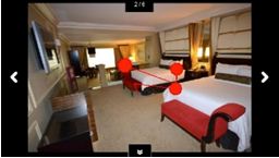
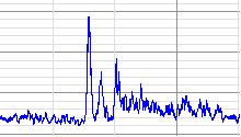
Shopper's verbal response: "This one makes me feel sideways."
Positive response to the same room with better perspective:
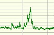
Shopper's verbal response: "This is a good shot, feels normal."
Qualities and Content Displayed in Images. The qualities of a hotel room shown in images that had the most impact on shoppers were neatness and clean design lines, light and view, spaciousness, and attractive color scheme or just clean, crisp white. The negative image qualities were room messiness and clutter, clashing colors, odd angles or camera lens distortions, and missing pieces/views of the room: most commonly missing were bathrooms, closets and sometimes window shots. Also, as the age of the shopper increased there was an increasing importance attached to comfort of the room and bathroom, and the need for images of the bathroom, closest, etc.
For these shoppers, the images that seldom had an impact were ones of the restaurants (unless it had a view), outside building shots, local attractions or landmarks not visible from hotel, front desk and lobby; and since these were leisure and not business or event trip shoppers, meeting rooms, banquet and ballrooms made little impact. Though it seems reasonable that many of these images should be included to round out the impression of the hotel, these findings suggest they should not be the primary images that the hotel displays at the beginning of the image order, unless they contain a unique, attractive feature.

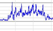
Shopper's verbal response: "They couldn't even take the time to make the bed."
In summary, when assembling image libraries hoteliers should follow these tips to maximize conversion opportunities:
- Prioritize images of bedrooms with pleasing window views
- Next, include images of secondary spaces (i.e. terrace, restaurant) with attractive vistas
- Ensure images are well-lit, using natural light wherever possible
- Display any unique features/attributes of the hotel
- Ensure rooms/spaces are pristine; avoid clutter and mess
- Remember to include bathroom and closet photos
- Avoid distorting camera techniques
- Include both close-up and perspective shots

