Color influences our perception. It can change the way we think and feel about things..
For example, studies show that yellow stimulates appetite, whereas blue suppresses it. Darker colors like red and black can increase visual weight, while pastels lighten things up. More interestingly, perhaps, teams wearing red win more often!
But how can they be used to power up your hotel website for maximum conversions?
In today's post, we'll look at the power color does—and doesn't—have to drive a potential guest's decisions. Let's go.
Color: How It Steers Our Emotions Colors are often used to communicate emotions, but they work on a different level than description and expression. Colors, used correctly, have the power to nudge emotions in a specific direction:
- Blue indicates trust, serenity and calmness
- Yellow can make things look warm, friendly and fun (Interesting fact: 75% of pencils sold in the U.S. are yellow)
- Green symbolizes nature. It usually implies health and peace, and nature-oriented hotel websites tend to have a "healthy" helping of it
- Black strikes us a serious color, doesn't it? Branding experts say black communicates "glamour, sophistication and exclusivity"
- Studies show that orange physically and mentally energizes people—it suggests confidence, competition and haste
- Pink is used to communicate femininity, nurture, care and seduction
- Red creates a sense of urgency and activity
A lot to remember? No problem! We found this infographic to break down a few of the emotional impacts of colors for you:
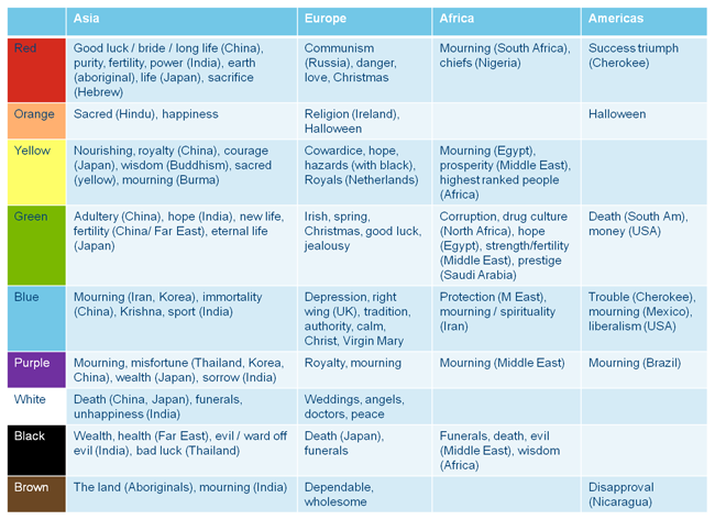
You should also be aware of the cultural implications of certain colors. For example, white is the color of death in China and Japan. However, in Europe, it indicates peace, innocence, and simplicity. Know your market to avoid costly mistakes!
The graphic below gives a little more insight:
How Color Has Boosted Conversion For Others To some, color may feel like a small thing. But this startling case study from Bing proves otherwise.
Switching links to a more powerful color sprung their revenue up by $80 million. In this case, the power came from switching the shade to one "quite similar to the one used by Google."
For a 5 minute fix, it's a shocking result that highlights the impact that choosing the right color can have.
Another case study from Content Verve reinforces the value of color:
Changing their CTA color from blue to green created a 35.81% boost in conversions.
Dan Mcgrady from Dmix also received a 34% conversion lift by switching his CTA from green to red.
The case studies above highlight the conversion boosting power of color. That said, keep in mind that what works for others may not work for you.
Your optimum color is dependent on your target market and their needs.
How Colors Affect Your Hotel Conversions We've discussed the influence of color. Now let's look at how that influence transfers to increasing hotel bookings and conversions.
Potential guests landing on your site want instant gratification, and the human brain process visual information 60,000x faster than text.
Tie the above facts with research that shows that 90% of snap judgements made about a product or person are based on colors alone, and you can see how important (correct) colors are to hotel website conversions.
Before processing a word of copy or moving the cursor an inch, your guest will subconsciously make split-second decisions and opinions—based on visual content like image and color—about your hotel.
This means your colors should:
- Compliment your brand
- Deliver the right message
- Draw attention to the right features (like your CTA)
You'll convert more visitors into guests because you make a stronger first impression.
Below are examples of how a few hotel site's colors do the above 3 points:
- The Savoy Hotel: According to research, brown "is a color that oozes security. It symbolizes home, contentment, peace and quietness." The Savoy hotel uses brown in its images to project a soothing, warm and secure atmosphere.
- Killashee House Hotel: The hotel instantly conveys a calm, elegant message with its white and green colors. The green connotes vibrancy, health and wellbeing, while the white creates a simple and clean atmosphere. Overall, the colors and images amplify the brand's message.
- Hollman Beletage: This hotel website does a praiseworthy job of using colors, images and design for a solid first impression that lasts. Their brand message is about giving "you a home away from home". The hotel boasts having only 25 rooms, and claims their smaller size helps provide a more personable and fun service. Their design and color scheme definitely back that message. The abundant use of orange stealthily injects the site with energy, confidence and warmth. Luxury and sophistication is suggested with the strong black background. Mix that with funny images and succinct, cheeky copy, and you're able to grasp what the hotel is about within a few seconds.
Conclusion Using color psychology to snag more bookings isn't about "tricking" guests. And it's not about playing on emotions or manipulating minds.
It's about knowing how your colors convey the mood and personality of your hotel. More importantly, it's about knowing how they can amplify its message.
Keep in mind: Small tweaks matter. But their power snowballs into huge conversion increases when they serve a collective greater purpose.
You wouldn't expect your hotel business to boom just because you upgraded 1 room or added a conference room, would you?
Probably not. You know that it's the cumulative effects of positive tweaks to your business can create a big impact.
Similarly, with your hotel site's conversions, color psychology isn't important in and of itself, but rather as an integrated part of the page's visual hierarchy.
How do you use color to drive more bookings? Let us know below!


