By Nate Lane
At last year’s Skift Global Forum in New York City, Andy Wang, the CEO of 500px, discussed how travel brands can dramatically improve customer engagement levels by using the right types of photos and visuals.
By studying reactions to different images, Wang’s team made a series of fascinating and surprising discoveries that revealed how different choices in style, composition, quality and perspective have the power to radically alter the way customers respond to brands.
Based on some of those insights, here are 5 tips that hotels can apply to choose images that can help convert lookers into bookers.
1. Know your audience
Just like a scatter-gun approach to marketing yields limited results, the same holds true for photos. That’s why it pays to focus your choice and style of images based upon the needs, desires and preferences of your core customer.
Wang’s research revealed the immense value of taking a personalized approach to photography. When comparing how Asian travelers responded to different images of New York, it was found that a bird’s-eye perspective instead of a traditional wide shot increased engagement levels rise by 81%.
Changes in perspective and image choice were found to have a major influence on engagement levels, highlighting the importance of knowing your audience and understanding how they tick.
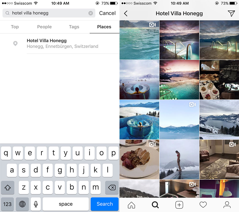
Impractical and costly as it might be to run your own A/B photo testing strategy with your website, there are other simpler ways to gauge the desires of your target audience. One simple way is to head to Instagram and check out the most popular rated posts for your own hotel (or other hotels in your comp set). You can do this by searching for your hotel using the Places tab. Often, the “Top Posts” featured under your location tag will reveal what travelers love about your property, enabling you to select images that are most likely to resonate with them.

2. Check out your competition
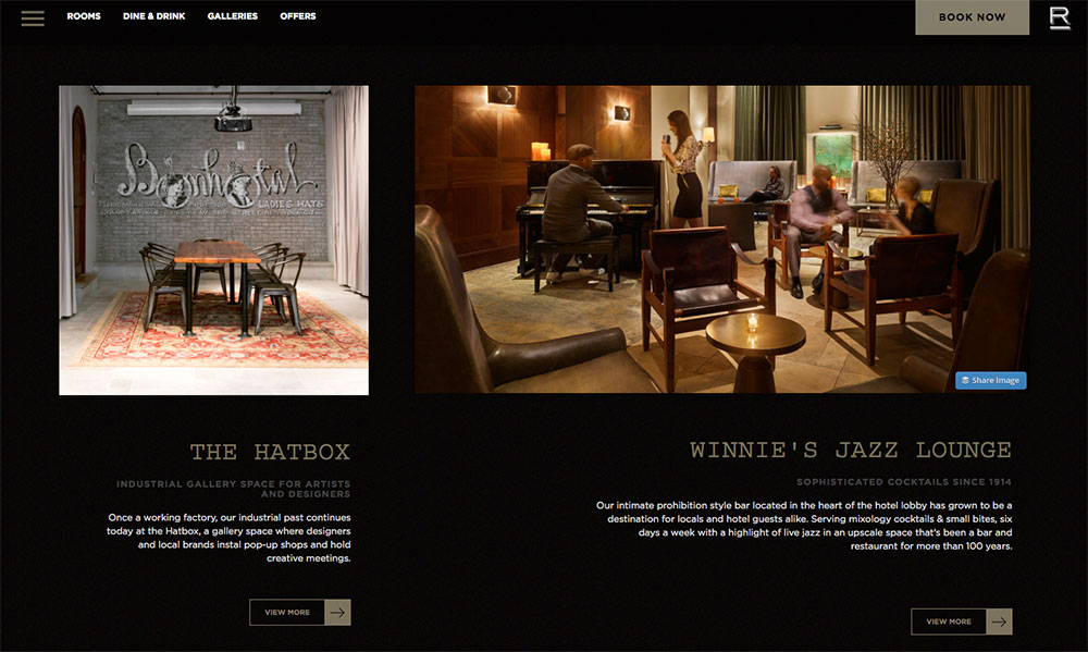
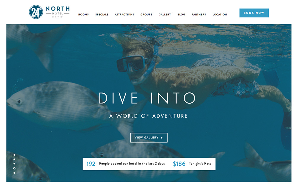
As well as understanding your audience, it’s crucial to check out your competition. How are they using images to market themselves? Is there a consistent visual style? An over-reliance on stock photos? Do most of your competitors showcase their rooms but fail to bring the local area to life?
Once you’ve identified any consistent patterns, you’ll have the basis to use your own images to create a genuine point of difference.
If you’re using a professional photographer, talk with them about producing a unique photo gallery based on variations in choice, style, perspective, and mood. If you’re relying on stock images, try to avoid the most popular ones that are being used by everyone else.
By aiming to be intentionally different whenever possible, you’ll instantly stand out when a potential guest starts comparing you with the rest of the hotels in your area.
3. Local and authentic

According to Wang, one of the big pitfalls travel companies fall into is a mindset called “Group Think.” This phrase refers to the very practice just mentioned—where brands use similar images to represent the same place. For instance, shots of Paris on virtually all OTA sites feature the same wide shot of the Eiffel Tower, which does little to help consumers differentiate the OTAs and the properties they feature.
In an age where travelers increasingly want a local and authentic experience, your images should also feel more unique and local in nature. Instead of a generic wide shot of a city, a close-up of a couple holding hands by a prominent landmark can tell a more interesting story. Equally, switching to a street-level perspective can help people feel part of a scene instead of a being a passive observer being kept at a distance.
The photos you use should also reflect the spirit of your hotel and destination. Are you a city hotel where people spend their days exploring? Don’t just show a city landscape, show what it’s like to explore local boutiques, rent a bike, or grab the perfect cappuccino at a local cafe.
If you’re an upscale resort where people go to kick back, reflect that in the imagery—show your guests reading by the pool, sipping Champagne in their room, or provide an incomparable view from the suite balcony.
By considering the interests of your guests, focusing on the strengths of your brand, and aiming for an altogether more local feel, you’ll create a visual style that represents your hotel and destination in a fresh and appealing new way.
4. Use people to tell a story

Images that feature guests in them are effective for a number of reasons. First, they add a sense of context that helps others relate to a scene. A beautiful photograph of a hotel spa might look inviting, but showing the same spa with a blissfully relaxed guest enjoying a treatment makes it easier for others to imagine indulging in the same scenario.
The way you feature people in images can also help evoke a certain tone and set expectations. For instance, photographing a solitary guest lounging by your pool can help convey a sense of luxury and escapism, encapsulating a mood that instantly chimes with a certain target market.
The same principle can be applied to your destination. From a chilled-out vacationer flopped out in a beachside hammock, to a group of friends sipping drinks in a buzzing bar, the way you use people in a scene can help add tell a richer story beyond the scenery and venue in question.
Whenever possible, use genuine photos instead of stock images. While the latter can be fine for showcasing a destination, people can spot a “fake” smile a mile off, which can immediately undermine any sense of authenticity you might be trying to create. Using genuine images instead of stock photos has also been shown to greatly improve conversion rates.
5. Keep it varied

Finally, it’s important to focus on creating variation. For instance, having a mix of close-ups and wide shots in rooms can create differences in mood, add context to a scene, and help answer practical questions.
A study by Expedia found that when people were shown multiple features of a hotel room, they felt like they were getting a fuller and more accurate perspective of where they might be staying, leading to an overall more positive impression.
Variety should also be applied beyond the hotel room and include a range of angles and perspectives around social spaces and amenities. Hotels such as Padre Hotel Bakersfield do a great job of this, providing potential guests with a richer and more complete perspective that plays an important part in the decision-making process.
The whole idea of variety can be applied in numerous other ways, including the time of day. For instance, taking a photograph of your lobby at dawn and at dusk can create an entirely different mood and tone that gives potential guests a whole new perspective of your property.
Imagery is a worthy investment
The images you choose to market your hotel can make or break your brand. Every photograph used is an opportunity to connect with your potential guests and reflect the spirit of your property and destination. For that reason, there’s huge value in making sure this whole process involves careful consideration at every stage.
Ultimately, the visual story you tell has the power to showcase everything that makes you unique, engage customers for longer, and move them one step closer to making a booking with you.

