By Steffan Berelowitz
Competing with OTAs for direct bookings continues to represent an uphill challenge for hotels. The likes of Expedia and Booking.com have become masters at conversion, investing millions to whisk shoppers from browsing to booking in the minimum amount of steps.
However, the transactional nature of this experience is far from inspiring. It also makes it hard for hotels to stand out and showcase their unique personality. Deals and limited offers therefore become the means of differentiation, which clearly isn’t good for business.
To stand out from the crowd and drive more direct bookings, it’s important to think of your hotel website as a platform to tell a story— a story that shows off your personality, creates a distinct brand image, and offers a compelling reason to book beyond price.
With that in mind, we’ll dive into some of the key ways you can use original content and design on your website to express your hotel’s identity and tap into the power of storytelling to increase your revenue.
Showcase your story with videos
Video is arguably the most powerful storytelling tool at your disposal. It can evoke a mood and capture the spirit of your hotel that sparks the imaginations of your guests.
These days, savvy travel marketers understand that video is most effective when it taps into the deeper, emotional reasons that people choose to take a trip.
Generator Hostels‘ video is a prime example of this approach. A snappy, pop video-style sequence on their homepage shows a group of young friends having a blast over a day of exploration, drinks and dancing.
It deftly appealed to the aspirations of its younger demographic, selling the amazing social experiences of travel. Visually, it has an intentionally low-budget feel that steers well clear of brand-heavy gloss.
In stark contrast, Canaves Oia Suites (a 5-star luxury hotel in Santorini) features a stunning video with high-end production values. However, the thing to pay attention to here is how the video focuses almost exclusively on the beauty of the destination, rather than the selling points of the hotel.
A poetic, somewhat abstract, narration overlays a series of dreamy scenes, from a luxury yacht cutting across a glittering ocean, to a young couple sipping Champagne in a cliffside pool.
Images of the hotel are fleeting, serving as a backdrop to the natural beauty that surrounds it. Instead, we’re invited to fall in love with Santorini and the experiences that await should we book.
As both examples demonstrate, hotel travel videos are arguably best used to tell a captivating story than sell amenities and services. When executed in the right way, they have the power to inspire, entertain, and open your audience’s eyes to the experiences that they hope to find — or perhaps haven’t even imagined.
Differentiate your story with a tone of voice
A tone of voice is not what you say, but how you say it — for example, by adopting a conversational, formal, witty or quirky tone.
Out of necessity, every OTA has a specific tone of voice and format that they apply to every hotel listing. OTAs list thousands of hotels and need to market them to an incredibly wide and diverse audience. Adopting a neutral tone as part of a uniform template serves this purpose, but inevitably makes every hotel listing seem familiar and formulaic.
That’s why crafting a distinct tone of voice for your hotel website is vital — it allows you to stand out from the crowd by showcasing your property’s personality and building an all-important emotional connection with your audience. In fact, research shows that people buy on emotion and then justify with logic.
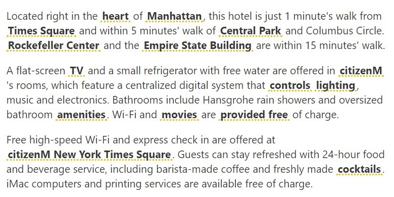
As a practice, let’s look at the way citizenM New York Times Square Hotel is described by Booking.com compared with citizenM’s own website. As you can see, Booking.com describe the hotel’s amenities and location in a formal, neutral tone.
This is fine for answering practical questions that travel shoppers might have, but it does nothing to sell the personality of the hotel. In contrast, the tone used by citizenM on its own homepage bubbles with conversational language.
An easy-going informality gives an instant flavor of the brand’s youthful personality. It’s aimed squarely at a certain kind of customer and seeks to talk with them on their terms. Notice how amenities and practicalities are still mentioned, but they’re done so in a chatty way that hints at the experience citizenM hotel offers.
When it comes to choosing your own tone of voice, start with your audience. There’s no point in adopting a young and sassy tone if your typical guest is an over-50s business traveler. Equally, younger travelers will be put off by formal language that doesn’t mirror the way they talk with friends and favorite brands.
Your tone should also accurately reflect the experience you offer and the feeling of what it’s like to stay with you. When you get this combination right and tap into the mindset of your audience, you’ll build a rapport with them that’s far stronger than using a generic tone to appeal to everyone.
Highlight your story with photos
While OTAs feature extensive image galleries, there’s no real story going on. Clicking through a series of images provides information, but little emotional context. In contrast, the homepage of a hotel website is able to use images more thoughtfully by highlighting certain features and amenities more impressively.
A lot of hotels now use full-screen photos on their homepage to grab and focus their audience’s attention on the most compelling selling points.
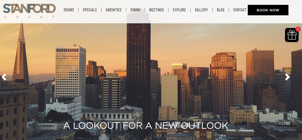
For example, the homepage of Stanford Court Hotel features a full-screen photo of the San Francisco skyline. It immediately catches the eye, and conveys one of the hotel’s major selling points: a fantastic location and spectacular city views. The accompanying tagline, “A lookout for a new outlook” adds further context to the experience of staying here.
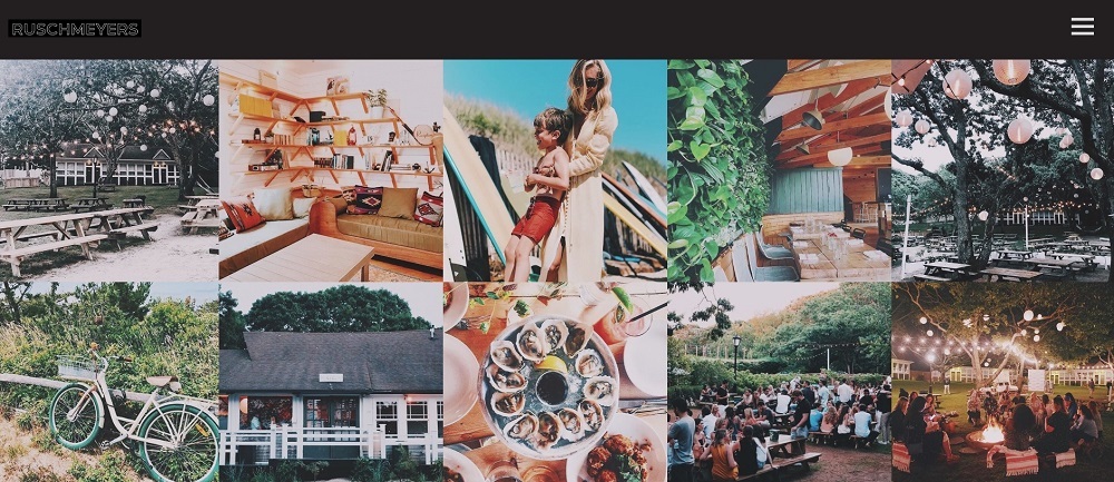
Meanwhile, the homepage of Ruschmeyers in Long Island gives over its entire homepage to an Instagram-style photo gallery that sells a rustic image of travel, defined by family time and group get-togethers.
In order to choose the right images for your own hotel website, it’s worth thinking about the kind of visuals that say something unique about your property, create an emotional context, and express the kind of experiences you offer.
Accentuate your story with colors
The impact of color on your audience should not be overlooked. Specific colors have been found to alter brand perceptions, and research has shown that 85% of shoppers say that color was a primary reason for their purchase decision.
The choice of color gives a snapshot of your hotel’s persona, subconsciously communicating a feeling that goes beyond words. For instance, take a look at the homepage of The Saguaro Hotel in Palm Springs.
It immediately gives you a sense of the hotel’s playful personality. Candy-colored visuals not only reflect the property’s unique decor, but also imply that this is a place where it’s always summer, tropical, and carefree.
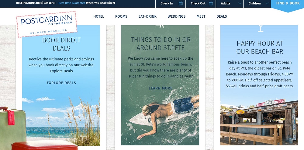
The website of Postcard Inn in Florida is splashed with casual images full of fresh blues and greens that reflect its barefoot, by-the-beach lifestyle.
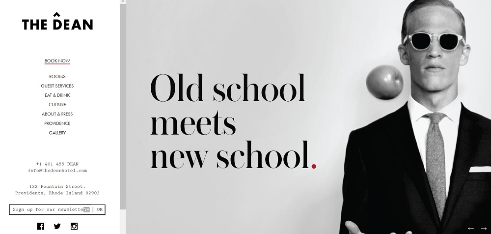
In stark contrast, The Dean Hotel in Rhode Island uses a moody black-and-white color scheme that hints at the hotel’s old-world style and sophistication. It ties in nicely with the hotel’s somewhat macho image that seems to be targeted at discerning business travelers.
In all examples, color is cleverly used to set the scene for what’s about to come. The key takeaway here is not to carelessly use color for the sake of it, but to think about how it might be used to reveal the spirit of your hotel.
Time to tell your story
While OTAs are focused on communicating practical information, your hotel website can tell an engaging and unique story that inspires your audience.
To tell an authentic story that is true to the experience you offer, you need more than just a beautiful website. By featuring unique design and original content, you can spark a sense of wanderlust among your audience and build an emotional connection that incentives them to book direct with you.


