By Simone Puorto
And if that sounds just like business common sense, a ton of studies and industry literature prove that this simple integration can boost conversion rates up to 40% (source: AZDS Interactive Group ). ONYX Hospitality Group observed a 40% increase in conversion rates following the integration of SynXis into their site; similarly, TFE Hotels experienced a 21% rise in conversion rates after redesigning their websites with integrated booking engines, while Loews Hotels & Co saw a 30% increase in direct bookings. And the list goes on Ad Infinitum.
Quoting these case studies might seem overkill, as this is a no-brainer to me. When users are ready to book, you want to keep them on the same website, don’t you? Well, apparently you don’t. Again, this should have been standard practice from the beginning, but is that the current situation in our industry? Hell, no!
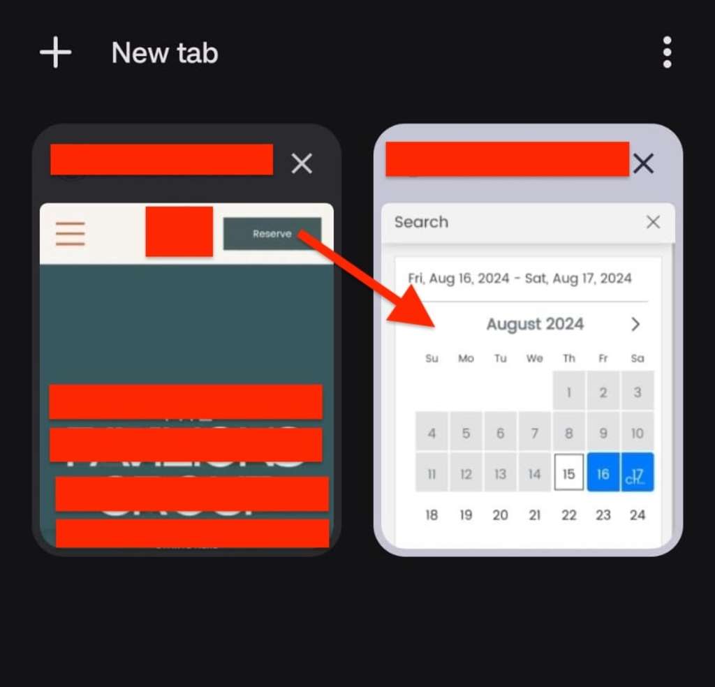
Currently, when users click on the “BOOK”button on most hotel websites, they’re redirected to a different URL, often with a completely different design and UI, and it feels like they are leaving the website (because, guess what? They are!). This is a significant UX flaw that heavily affects conversion rates.
The issue is worse on mobile devices, where most traffic comes from. Opening the booking engine in a new tab (which is always the case for websites with e-commerce not integrated into the site) disrupts the flow and confuses users, leading to higher abandonment rates.
Ever thought about it? Users now have two tabs open and no idea why they’re now on a website called synxis.com while they were navigating the “hotel whatever” website just a minute ago. Again, we are industry professionals (well, most of us, anyway…), but travelers are not. They shouldn’t have to master the industry lingo just to book a room, should they?
Here’s Why Your Fancy Hotel Website is Not Converting Simone Puorto — Source: Travel Singularity
And, if you don’t trust my opinion, trust the data: studies show that mobile users are 40% more likely to abandon a transaction when faced with such a bad user experience. And that’s what I call the definition of a bad UX.
Moreover, there is the brand perception issue: as I mentioned, most travelers are unfamiliar with SynXis, SimpleBooking or other booking engine provider names. For the average user, moving from brand.com to synxis.com is like placing items in an Amazon cart and then being redirected to eBay to complete the purchase. This not only confuses users but also diminishes trust and brand recognition.
For the average user, moving from brand.com to synxis.com is like placing items in an Amazon cart and then being redirected to eBay to complete the purchase.
Now, to quote Lethal Weapon, I am probably too old for this sh*t, but with 25 years of experience in this industry (half of it spent building websites for top hotel brands), I’ve seen little to no difference in conversion rates between a $100,000 website and a $50 WordPress template. The real impact on conversion comes from having a well-integrated booking engine. When it is not, your fancy design won’t make any difference.
This is common knowledge in our industry: hotel websites function as bottom-of-the-funnel marketing channels, not top-of-the-funnel. They DO NOT create traffic. They simply TRANSFORM existing traffic into bookings.
Hotel websites function as bottom-of-the-funnel marketing channels, not top-of-the-funnel. They DO NOT create traffic. They simply TRANSFORM existing traffic into bookings.
It’s an exoteric concept (anyone in the industry knows it) but also esoteric (web agencies try to make it look like websites can increase brand awareness—spoiler: they do not).
When users land on an official hotel website (unless we are talking about megabrands like Marriott International or Hilton ), they already know everything they need to know about the hotel. Most literature indicates that over 95% of users who visit an official website started their journey elsewhere (usually on an OTA or a review site) and only came to brand.com to find a better price or a superior user experience (usually, both).
There is a lot of ego and vanity involved in creating hotel websites, and while I understand that, you can probably achieve better conversion rates with a website from the 1990s if you make the booking experience dumbproof. Think about it: this is why metasearch advertising has such a great ROI—users interact with ONLY ONE website, and that’s the booking engine, not brand.com.
You can probably achieve better conversion rates with a website from the 1990s if you make the booking experience foolproof.
Now, I am not trying to diminish the work of web designers. Yet, after having delivered five websites a week for nearly ten years (if you do the math , that’s 2,400 hotel websites), I have had the opportunity to conduct extensive A/B testing, and I have reached the same conclusion that many industry experts might not openly admit: conversion is all about the UX of the booking engine, the integrated experience, and offering a better rate (why would anyone book on an official site otherwise?).
So why am I even writing this? Because it bothers me that this elephant in the room is rarely (if ever) discussed.
Is there a secret Masonic lobby in hotel web design agencies? If so, I have never been invited to it. Give me a call, web-design Illuminati! (here’s my number: +39 375 634 34 56).


